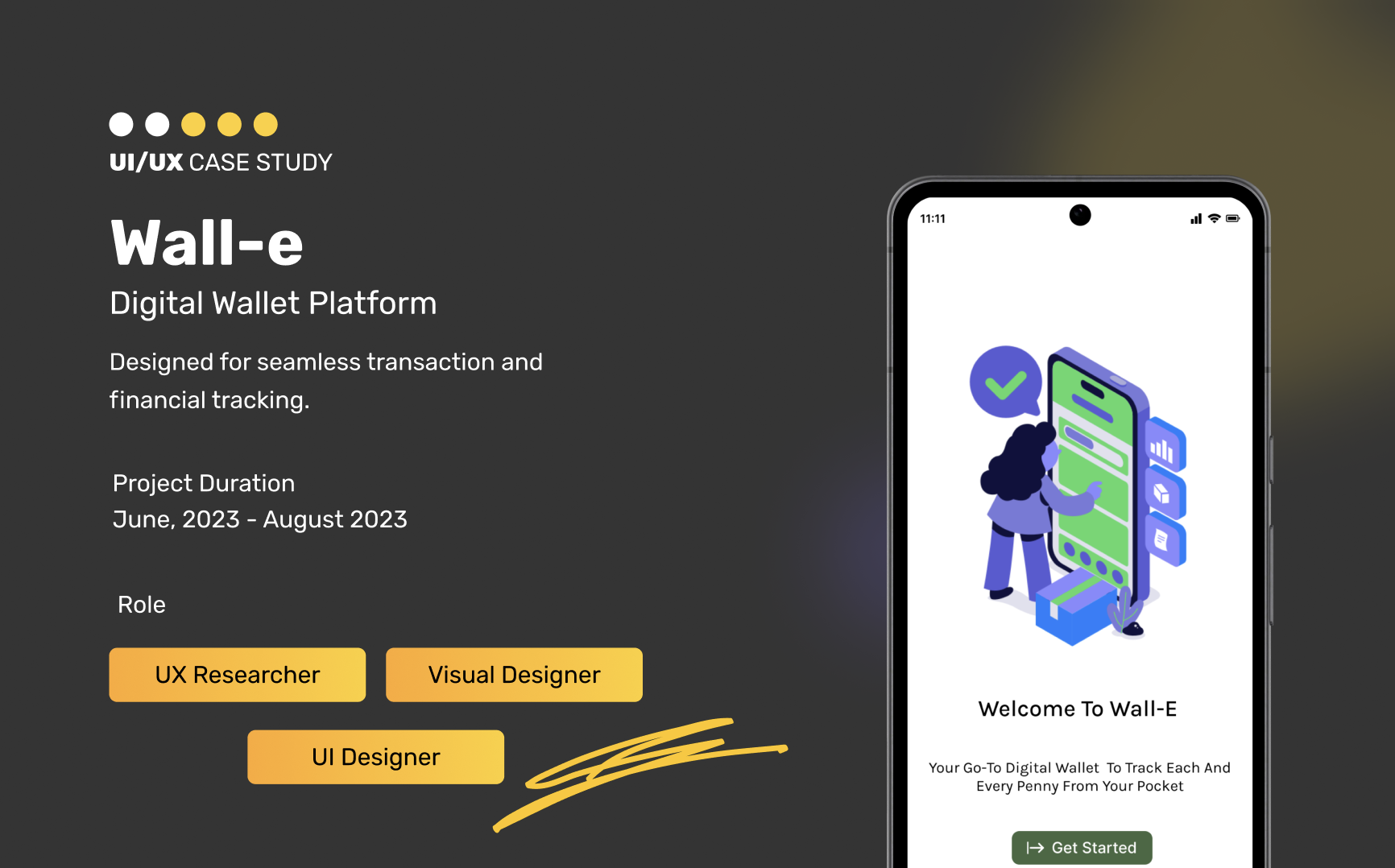
Wall-E, 2023
Website designed for smarter transactions and better budgeting!
BACKGROUND
Wall-e is a mobile app designed to revolutionize digital wallet usage by providing users with comprehensive financial transaction tracking and detailed budgeting features. Unlike traditional digital wallets that lack in-depth transaction history and financial reports, Wall-e aims to empower users to make informed financial decisions through mindful spending and saving practices.
GOAL
The inspiration behind Wall-E came from a familiar problem — difficulty in managing day-to-day finances with intention. I wanted to design a tool that empowered users to spend smarter and save better. With that in mind, I defined the core goals.
- Enhance transaction tracking
- Detailed Financial Report
- Budgeting Tools
- Promote Mindful Saving
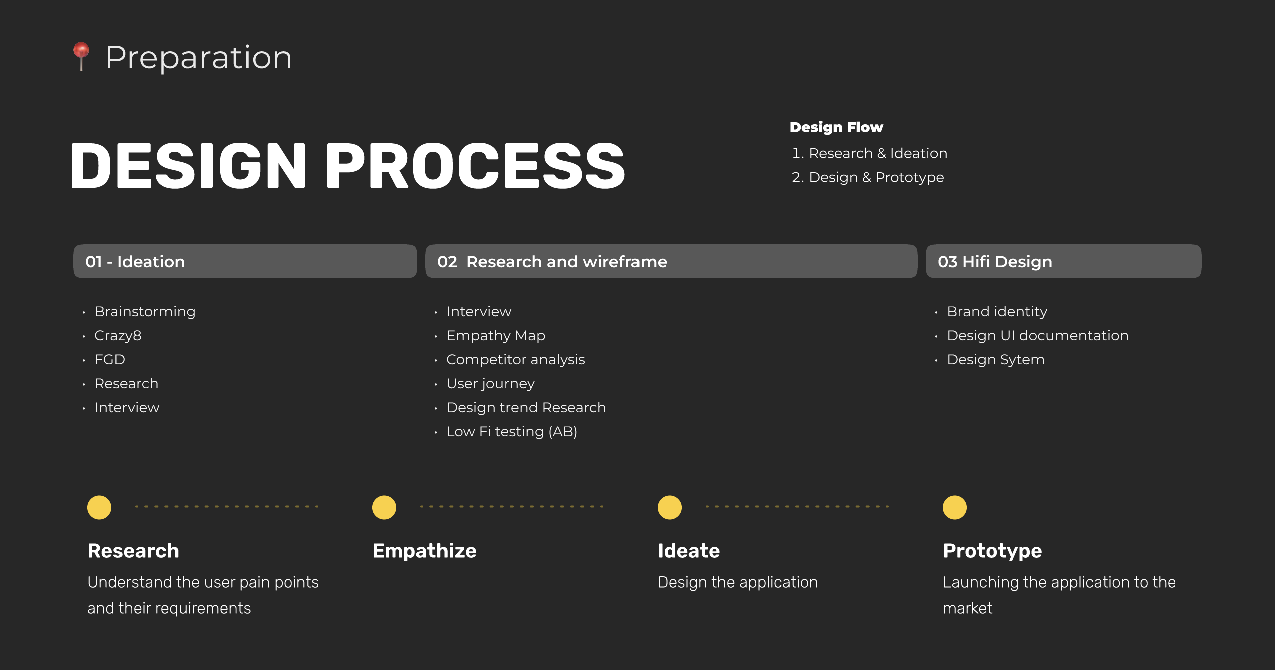
Design Process
USER RESEARCH
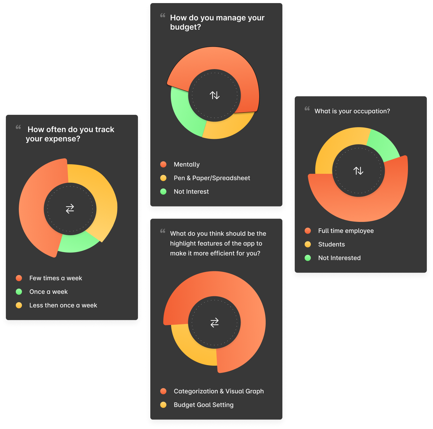
SURVEY
To gain insights into user behavior and expectations, I conducted a mixed-method survey with 10 participants aged 20–35 using Google Forms. The participants came from varied backgrounds, allowing for a broader understanding through both qualitative and quantitative data. From the research we had the following understanding.
The following pie charts highlight key patterns in users’ financial behavior, including how they track expenses, set budgets, and manage savings. This data provides a foundational understanding of user needs and pain points, guiding the design of features in Wall-E.
Key Observations:
- Many participants reported managing their expenses through memory alone, highlighting a lack of structured tracking systems.
- Few users follow a consistent budgeting routine, indicating a need for better reminders and goal-setting features.
- Most participants expressed interest in having visual graphs and automated tracking tools to reduce the mental load of financial planning.
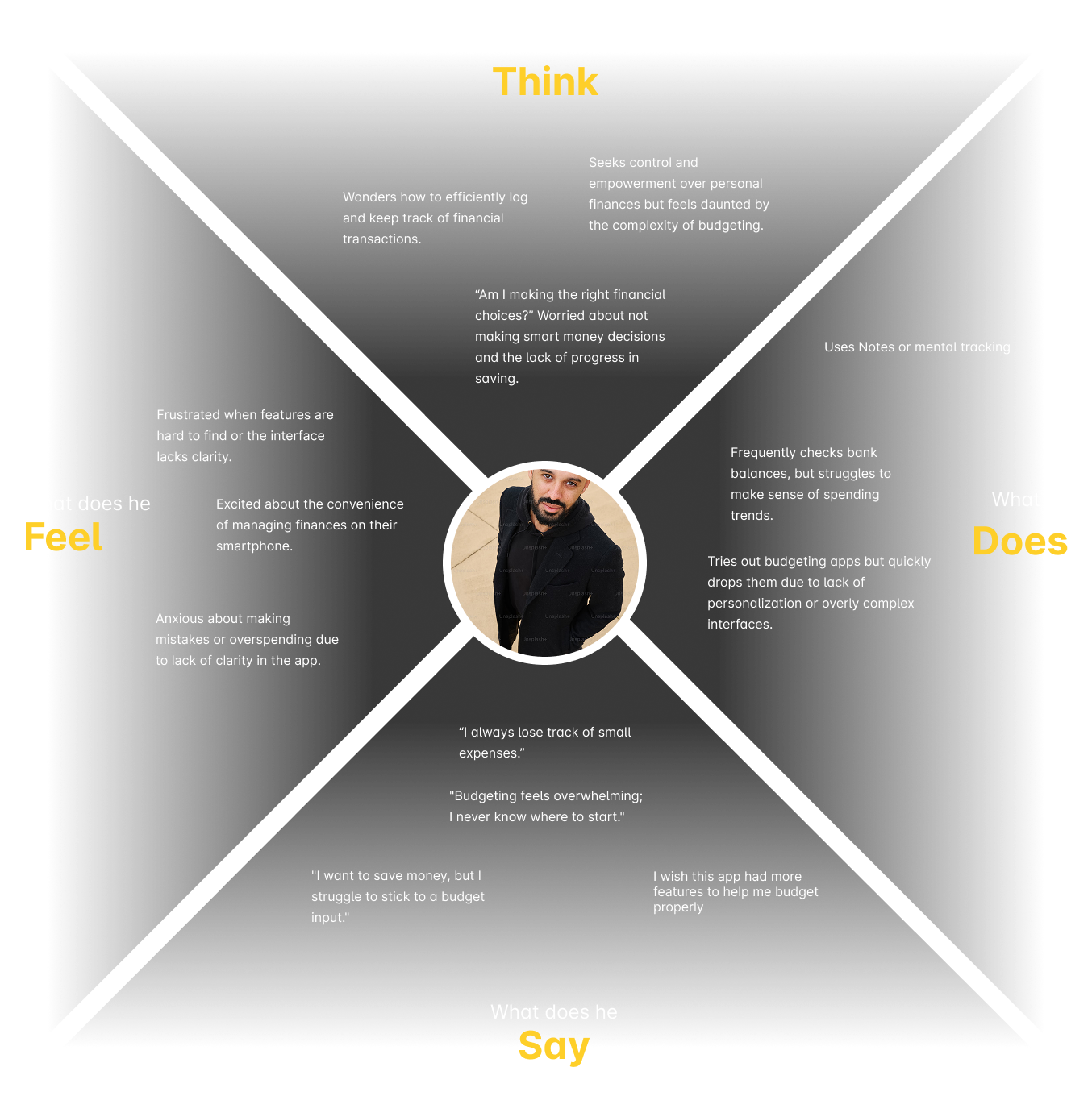
EMPATHY MAP
To better empathize with user behavior and emotional triggers around personal finance, I developed an empathy map informed by survey responses. This helped surface recurring frustrations, habits, and motivations that shaped the foundation of our design decisions.
INFORMATION ARCHITECTURE
Based on the user insights gathered, I mapped out the information architecture to support intuitive navigation and clear task flows. The structure was designed to prioritize users’ key goals—tracking expenses, setting budgets, and accessing financial insights.
The resulting sitemap outlines the core structure of the Wall-E app, ensuring that all primary features are easily discoverable and logically grouped based on user needs.
LOW-FIDELITY WIREFRAME
I developed low-fidelity wireframes to visualize key screens and test the app’s structure and layout. This step prioritized usability and allowed for early design iteration.
NEXT STEP
- Conduct usability testing on low-fidelity wireframes
- Iterate and refine wireframes based on test insights
- Begin visual exploration and high-fidelity prototyping
CONSLUSION
What started as a personal struggle with budgeting turned into a design journey driven by empathy, data, and user needs. Wall-E was crafted with the goal of simplifying the way users manage their finances, and every step—from user research to low-fidelity design—was guided by that vision.
With usability testing and further development ahead, the app is on its way to becoming a meaningful tool for mindful saving and financial empowerment.