Tallo Language Learning App
Tallo is a language learning app designed to help users practice and improve new languages through personalized, AI-assisted experiences. Our team of eight collaborated to create a solution that’s engaging, flexible, and user-centered. As a Product Designer, I contributed to the full design process, from initial research to final testing. This case study highlights our approach, challenges, and key design decisions behind Tallo.
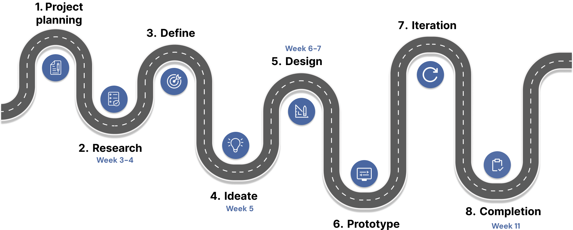
Project Overview
- Role: Product Designer
- Timeline: 3 Months (March 2025 – May 2025)
- Team: 8 Members
- Tools Used: Figma, Zoom, Google Docs, Notion
Research
To ground our design decisions, we rolled up our sleeves and dove into 10 popular language learning apps, each teammate taking one for a real test drive. Through hands on exploration and SWOT analysis, we uncovered what these platforms did well, who they served, and where they fell short.
To get even closer to the user perspective, we sifted through countless app store reviews, revealing raw, unfiltered feedback that highlighted everything from missing features to unexpected frustrations, insights that directly shaped our early design direction.
User Interviews
To get beyond assumptions and into the minds of real learners, we interviewed 10 graduate students through 30-minute semi-structured Zoom calls. After exploring competitor platforms, we wanted to understand how users actually engage with language learning apps in their day-to-day lives.
Our goal? Learn what they use, why they use it, and uncover key pain points and trends that influence their learning experience and motivation. We then synthesized our findings through an affinity mapping session to identify recurring themes and user needs.
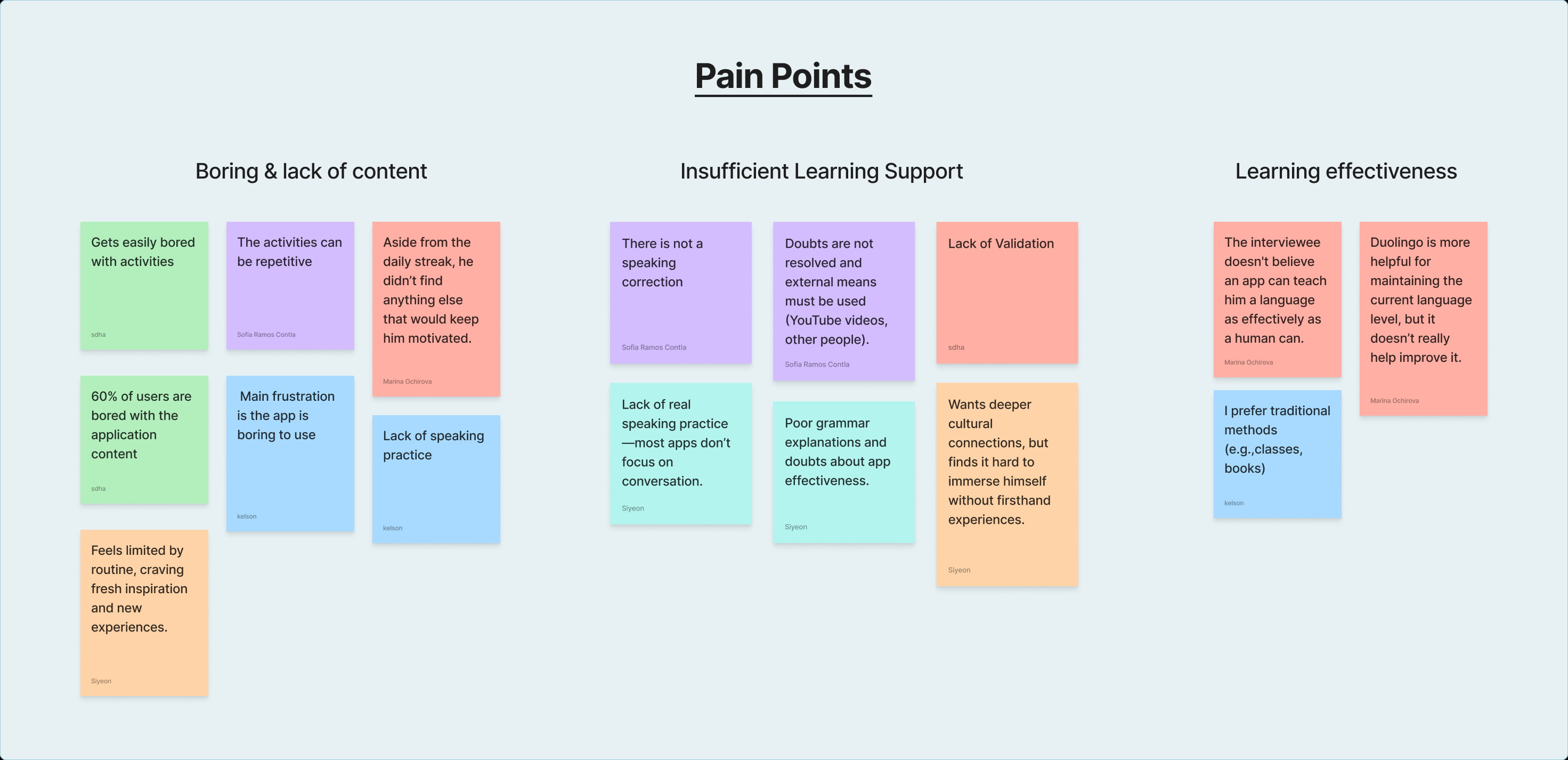
A few patterns rang loud and clear: users are bored, stuck, and skeptical. These honest insights gave us exactly what we needed: a clearer direction on what to fix and what truly matters to learners.
What was the problem?
With our research insights in hand, we transitioned into defining the problem and shaping our design direction. We created a user persona that reflected the core frustrations and motivations we uncovered. This helped us articulate the problem and prioritize what really mattered.
We understood that language apps are everywhere, but real learning? Not always. Users crave authentic interaction, not awkward silence or random chat requests. Many feel uneasy as some platforms start to feel more like dating apps than learning tools. And while AI has huge potential, it’s rarely used in ways that truly support or personalize the experience.
With this information our solution based approach was to design a space that’s safe, focused, and actually helps them speak with confidence
Ideation
With our problem clearly defined, we dove into a rapid-fire Crazy 8s session, eight ideas in eight minutes, per person. It was messy, fun, and wildly productive!
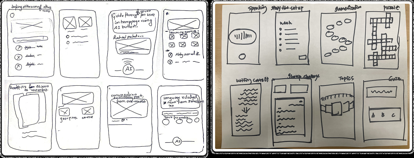
After bouncing around dozens of ideas in our Crazy 8s session, we narrowed things down to the features that best aligned with our research and user needs.
The winning concepts?
- AI-powered practice feature with scenario rooms for on-demand learning
- Live voice chat rooms for real conversation
- Customizable avatars to create a safe, identity-free environment
- Find a language partner by matching with native speakers based on users language goals
Prototyping
With several standout features in hand, we brought our ideas to life through low and high-fidelity prototypes. While each feature played a key role in shaping the overall experience, showcasing them all here would overwhelm the screen and you!
Since I was primarily responsible for designing the Live Voice Room, this case study will now on focus on that feature in depth, highlighting the design thinking, iterations, and final output.
Voice Room
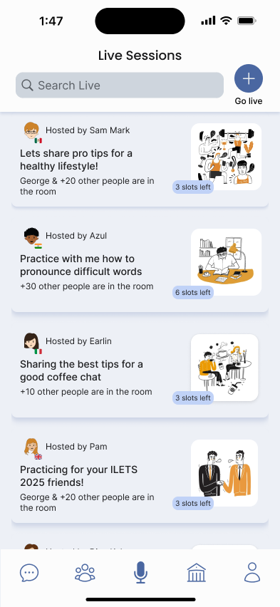
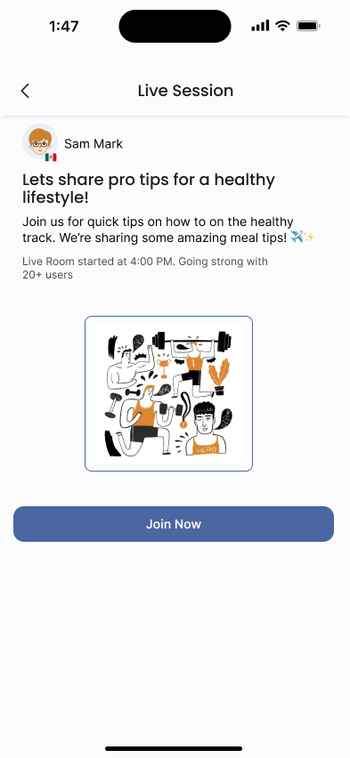
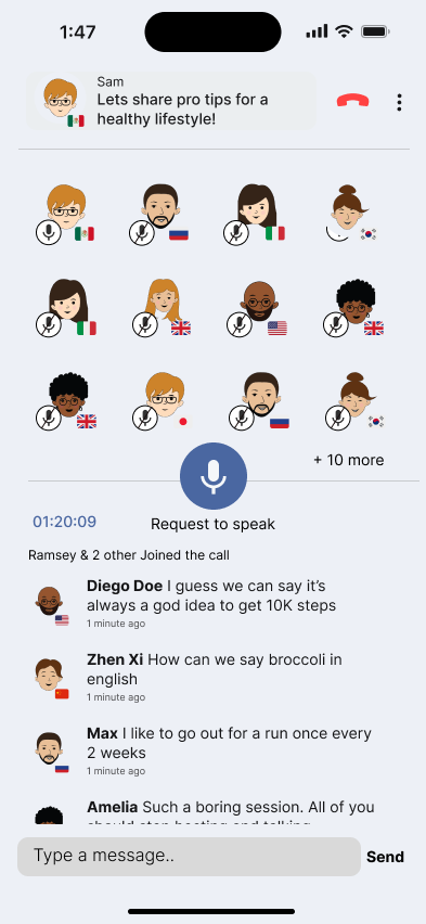
User POV: Joining the conversation
To design a seamless experience for learners, I focused first on the user’s journey, what it feels like to discover, join, and engage in a live voice room.
This flow prioritizes clarity, comfort, and ease of access, especially for those who may feel anxious about speaking in real-time. From entering the room to interacting with others, every screen was crafted to support confident, low-pressure language practice.

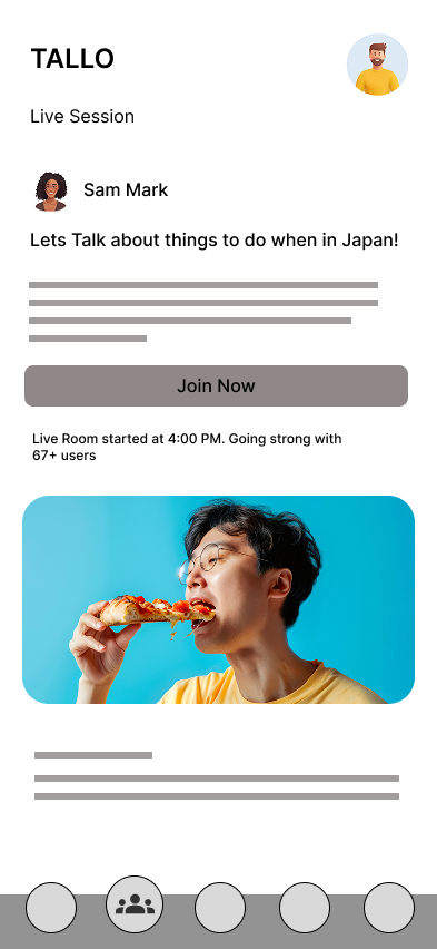
Live sessions screen
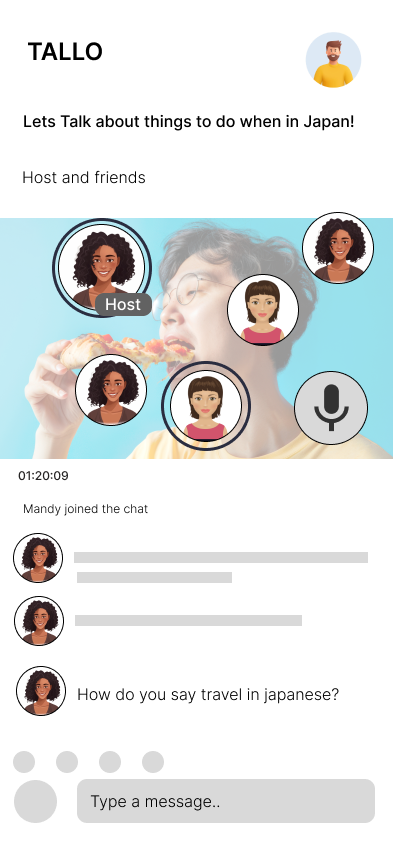
Live group chat info screen
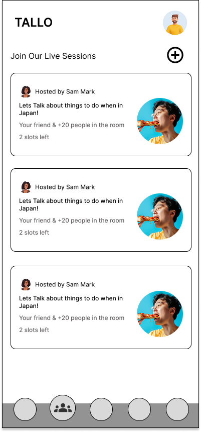
Live session screen
Host POV: Leading the room
Designing from the host’s perspective meant focusing on control, clarity, and smooth facilitation. As the one guiding the conversation, the host needs tools to manage the room, encourage participation, and create a safe learning space.
This flow ensures that hosts can easily start a session, see who’s joined, moderate discussions, and keep the learning environment focused and welcoming.
Live sessions Host screen
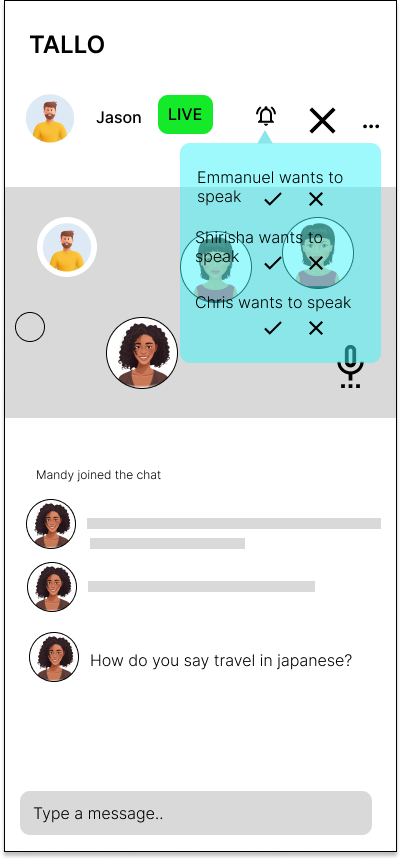
Managing Audience
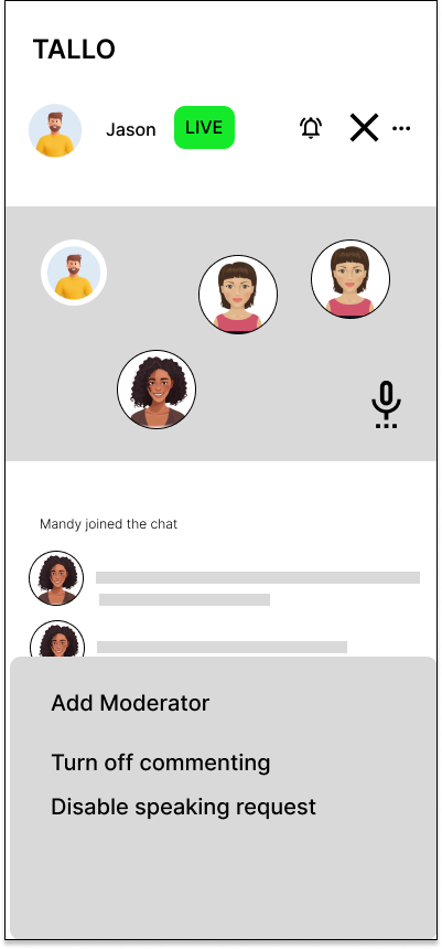
Moderate Discussion
Usability Testing
To see if our Voice Room actually made sense in action, we ran moderated Zoom tests with 5 participants. Using the think-aloud method, we observed users as they completed realistic, scenario-based tasks from both the user and host perspectives.
Their honest feedback helped us catch usability hiccups—like unclear entry points and confusing speaker cues—that we quickly addressed to refine the experience.
Usability Task
🧑🎓 User POV Task
You’re new to the application, try joining a voice room called “Things to do in Japan” and request the host to accept your speaking request so you can have a verbal conversation with the group.
🎙️ Host POV Task
You want to start a live session titled “Enjoying the Spring” and chat with your app friends. During the session, one audience member is being rude, walk through the steps to host the room, invite others to the panel, and remove a disruptive user.
Voice Room Feedback: Findings
Voice Rooms sparked a lot of interest, users found them fun, social, and full of potential for real language practice. The ability to request to speak instead of jumping straight in was a big win for structure and comfort. However, a few key pain points emerged:
- Crowded rooms = anxious learners: Large participant counts overwhelmed some users, especially first-timers.
- “Go Live” button confusion: The plus icon didn’t clearly indicate it would start a session.
- Moderation tools were missing: Users felt uneasy about the lack of controls to manage disruptive behavior.
What We Improved
- Renamed “Go Live” to “Start Session” with clearer visual cues.
- Added an option to limit audience size for a more focused experience.
- Introduced moderation tools like participant removal and reporting features to promote safety and respect.
“Being able to choose topics I'm actually interested in makes conversations feel way more natural”
User 4
Prototyping the Live Voice Room
After our usability testing and findings, the Live Voice Room began to take clearer shape.
From quick sketches to polished pixels, our goal was to make real-time conversations feel easy, natural,
and just a little bit fun.
We explored how users join, speak, and host sessions—turning feedback into smoother
flows, smarter buttons, and features that keep the vibe friendly and focused.
A quick walkthrough of the Live Voice Room prototype in action.
What I Learned
This project reinforced the power of a user-centered design process—from early research and low-fidelity wireframes to usability testing and high-fidelity prototyping.
I learned how crucial it is to test assumptions early, stay flexible through feedback, and design with both function and feeling in mind. Balancing user needs with technical feasibility and storytelling helped me grow not just as a designer, but as a thoughtful problem solver.
Conclusion
Tallo started with one big question: How do we make language learning conversations feel natural, not nervewracking? By talking to users, testing ideas, and redesigning with purpose, we turned that question into real solutions, clearer flows, better moderation with AI, and a friendlier space to speak up. This journey reminded us that great UX isn’t just about clean screens, it’s about giving people the confidence to connect.